My Happy Blog

Where I write about what I write with

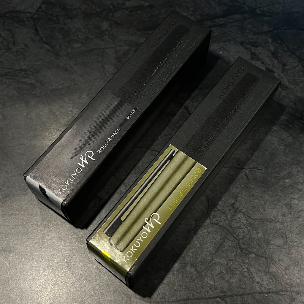
KOKUYO WP Limited Edition 2024 Quick Look

Recap: KOKUYO WP Quick Look

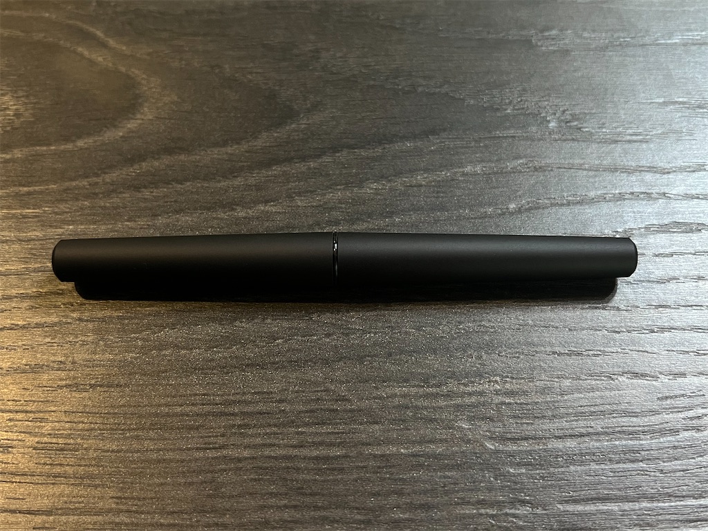
I was impressed with how the WP writes, but not so much with how it looks when capped, it's simply... too simple.

About a week after I purchased the WP, I suddenly remembered seeing videos of a rather eccentric pen by KOKUYO last year.
Thinking it might have been a variant of WP, I went online and searched for it, and there they were! Two limited editions released in 2024 that almost look like a new generation of WP.

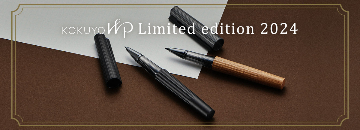
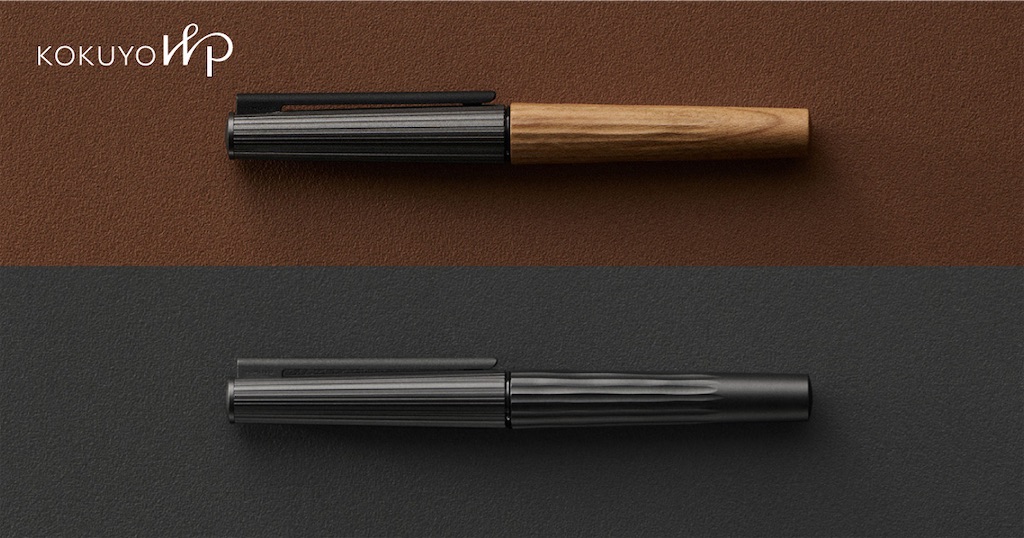
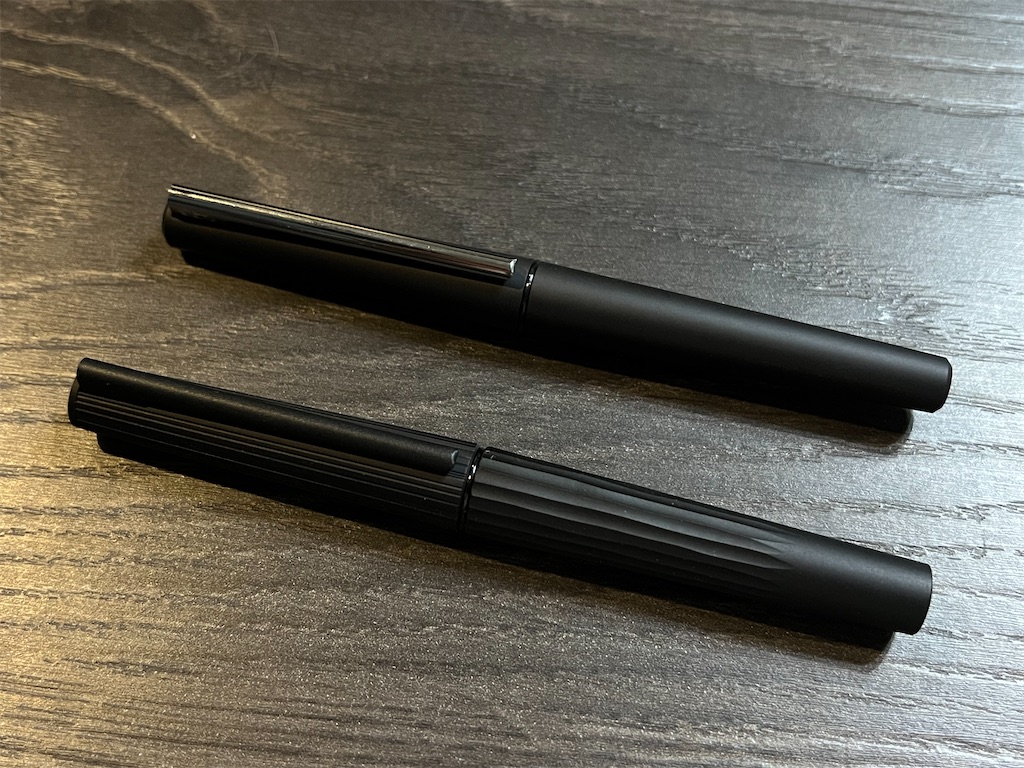
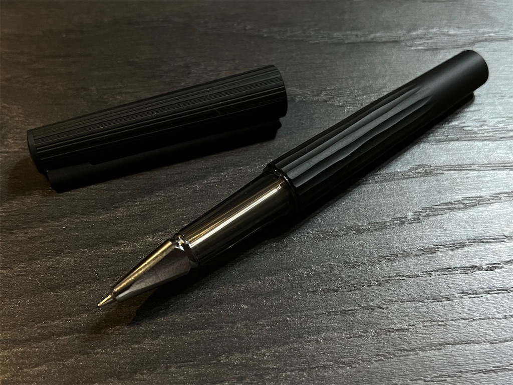
They share a similar silhouette with the standard WP but are thicker, with uneven grooves along the cap and barrel. They both come with a metallic black cap, but one has a wodden barrel made of cherry wood, and the other has a metallic barrel matching the color of the cap.

f:id:alvision:20250903010454j:image

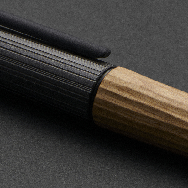
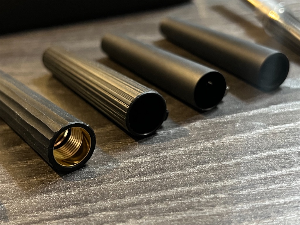
The outer casings of the limited editions were made slightly thicker to accomodate for the additional procedures: one called "Shaper Cut" on the cap that adds randomly separated thin grooves, and an unamed carving "program" that produces broader, uneven grooves on the barrel. Together they add what was missing on the standard WP: character.

The WP Limited Edition 2024 Wooden Shaft was limited to only 300 pieces (engraved with serial numbers), whereas the Metal Shaft was more "abundant" at 700 pieces. I consider myself lucky that I was more into black pens, and even more so that there was a seller selling a barely used Metal Shaft at a premium but reasonable price.

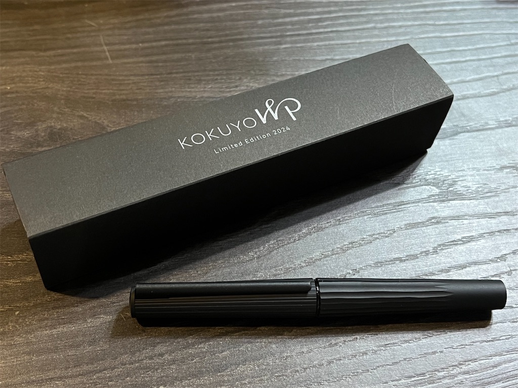
So here it is. The all black Limited Edition 2024 Metal Shaft.

f:id:alvision:20250903013951j:image

Beautiful isn't it? It comes in a rather simple box. Nothing too fancy there.

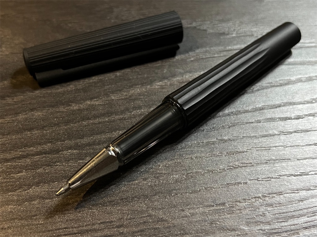
Compared to the standard WP, the added texture elevated the tactile experience of picking up, uncapping, and holding the pen, without compromising the writing experience.

f:id:alvision:20250903014043j:image

That added thickness creates a ledge between the barrel and the grip, which bothered me a little because I tend to grip my pens higher. So I had to adjust my grip to avoid the distraction, which in itself can be a distraction.

f:id:alvision:20250903015442j:image

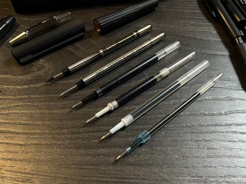
I have since gotten used to it, but if I am to use this pen daily, I really have to swap out the refill with something more suitable for quick writing. The two default refills just won't do: the rollerball is too thick and watery, and the sign pen is meant for slower, more deliberate writing.

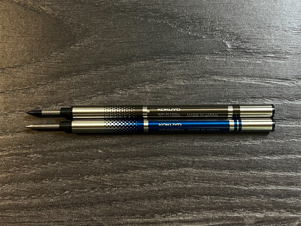
Since WP uses standard Euro style refills, options are plentiful. All the quality inks are available in this format, and I can confirm that Energel, SARASA, Signo, ZENTO, and JETSTREAM all fit perfectly in WP.

f:id:alvision:20250903015548j:image

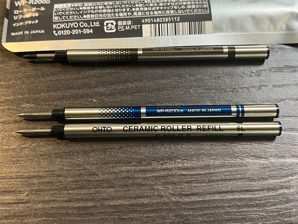
Problem is, these are only available in plastic tubes. It's convenient that the ink color shows through the translucent grip, but one major appeal of the WP on me was the metallic arrowhead look, which limits my option to a handful of European brands, or OHTO's original C-300 refills.

f:id:alvision:20250903015808j:image

f:id:alvision:20250903015836j:image

These limited editions were released to celebrate only the first anniversary of the WP series, and to me this already feels like the end game, I seriously doubt they can come up with anything better in this format.

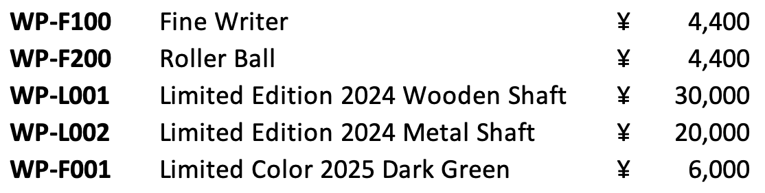
It looks like there probably won't be a new "Limited Edition 2025" for the upcoming second anniversary, because they've already released a Dark Green "Limited Color 2025" that's just the standard WP in a new color.

It would be interesting if they can continue the WP-L line with different designs every so often, but hopefully not too often, for my wallet's sake.

Endnote: I'm not sure what I watched last year, but I can't find a single review video of these limited editions on YouTube. But I did find the official makings video, it's worth a watch.


www.youtube.com

STAEDTLER REG Comparison Review

f:id:alvision:20250806233130j:image

Revived from Death

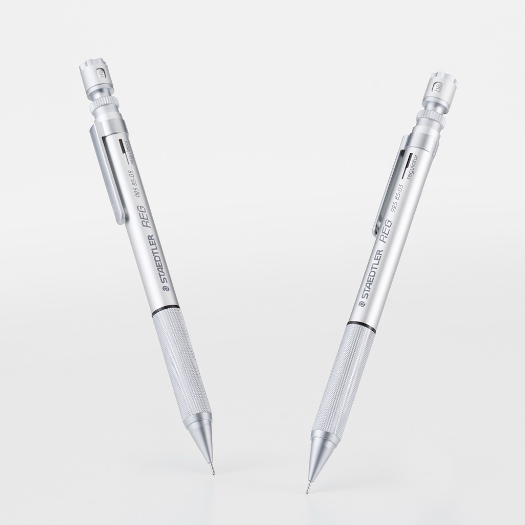
Earlier this year, two photos leaked in mechanical pencil communities showed what appeared to be new versions of STAEDTLER's 925 85 REG, one of the discontinued models in STAEDTLER Japan's 925 family.
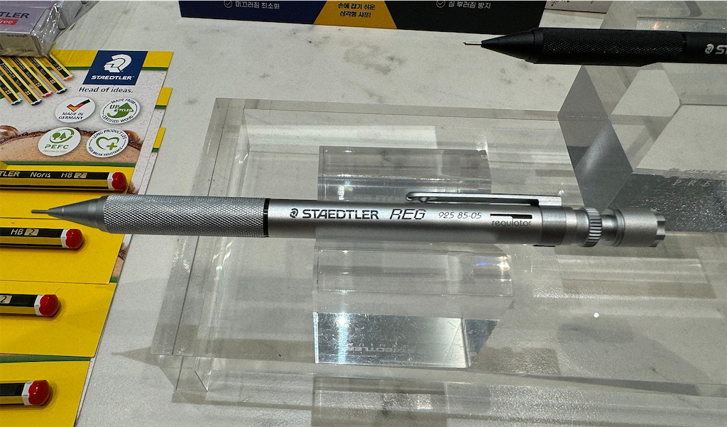
f:id:alvision:20250806233154p:image

This was huge news among fans, especially for those who didn't get a chance to buy the original REG. Initially, people thought this would be a limited remake in Korea (because of the Korean characters in the background), but it was later confirmed in a press release by STAEDTLER Japan that they are going to release this revived REG in Japan around July, in 0.3 mm and 0.5 mm, with a limited black edition coming out later this year.
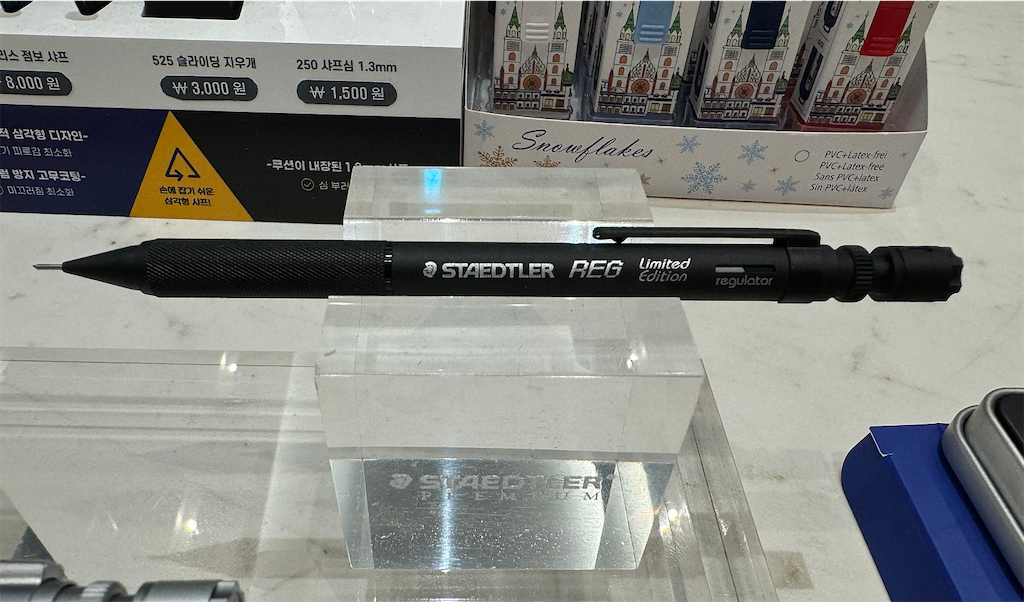
f:id:alvision:20250806233537p:image

The revived REG retails at ¥3,300 before tax, roughly doubling the original price of ¥1,400 (to be confirmed). Considering inflation, I think this is reasonable, especially since resale prices in Japan had climbed to around ¥5,000 before the announcement.
f:id:alvision:20250806233951j:image
ステッドラー REG 復活発売

I have since purchased the revived REG in 0.5 mm, and would like to do a review while comparing it to the original REG.

Packaging

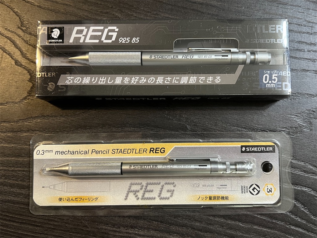
The revived REG comes in a clear PET box with folded paper inserts, similar to packagings used in other recent STAEDTLER releases.
f:id:alvision:20250806234322j:image

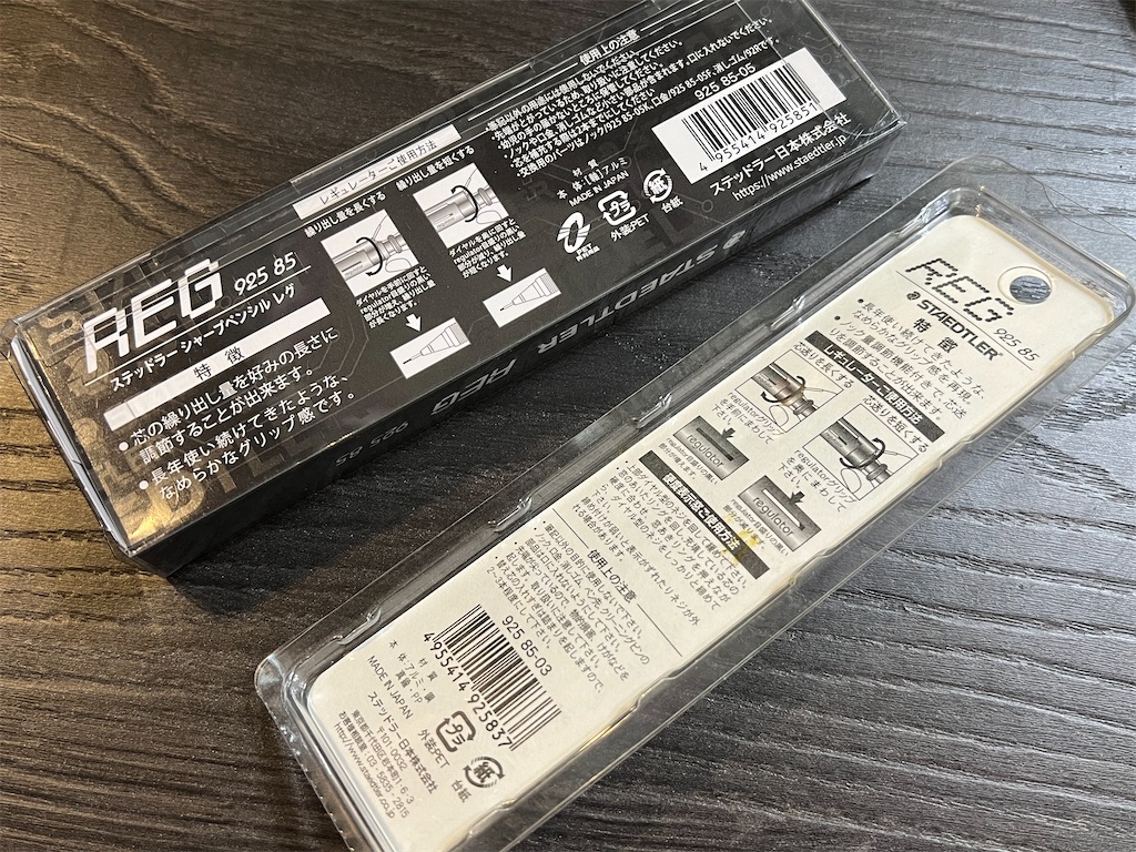
In comparison, the original REG came in a traditional clamshell pack with an insert card. The pencils themselves don't look very different (using the 0.3 mm here because I lost the 0.5's packaging).
f:id:alvision:20250806234415j:image

Much of the original packaging copy appears to have been revived too. Both highlight the same two main selling points, but in reversed order:

  1. Ability to adjust the amount of lead dispensed to your preferred length
  2. Replicates the smooth feeling of a grip that's been used for many years

To be honest, this is the first time I even noticed the second selling point (and it was actually the first on the original packaging). I always thought the regulator was what REG was all about, but apparently a knurled grip that feels used was a desireable attribute?

Exterior
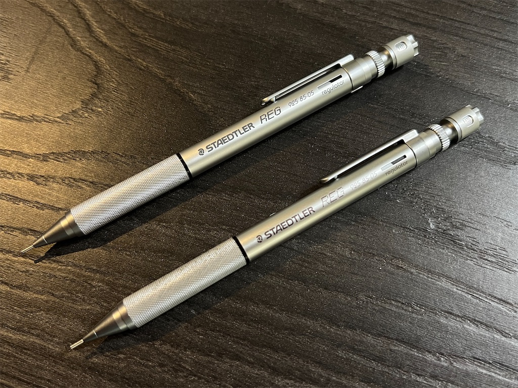
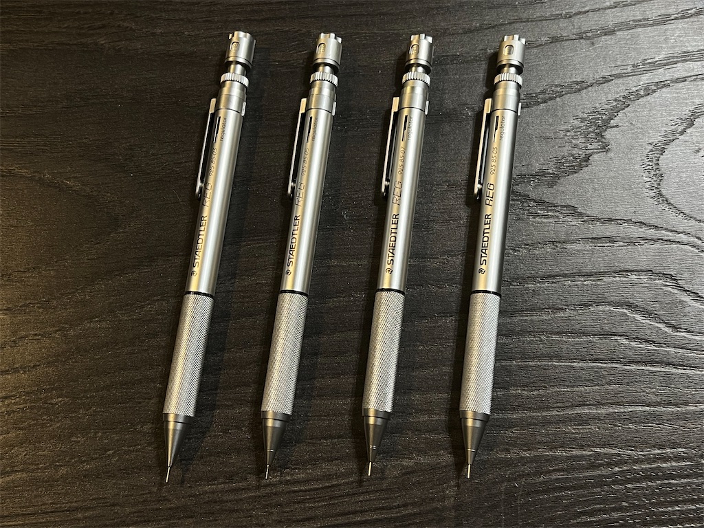
Side by side, the pencils look almost identical. It can be difficult to tell them apart if not for the updated REG logo.

f:id:alvision:20250807210716j:image

The printed markings are a deeper shade of grey on the revived REG, and the Mars Head logo on the clip is also engraved a bit deeper.
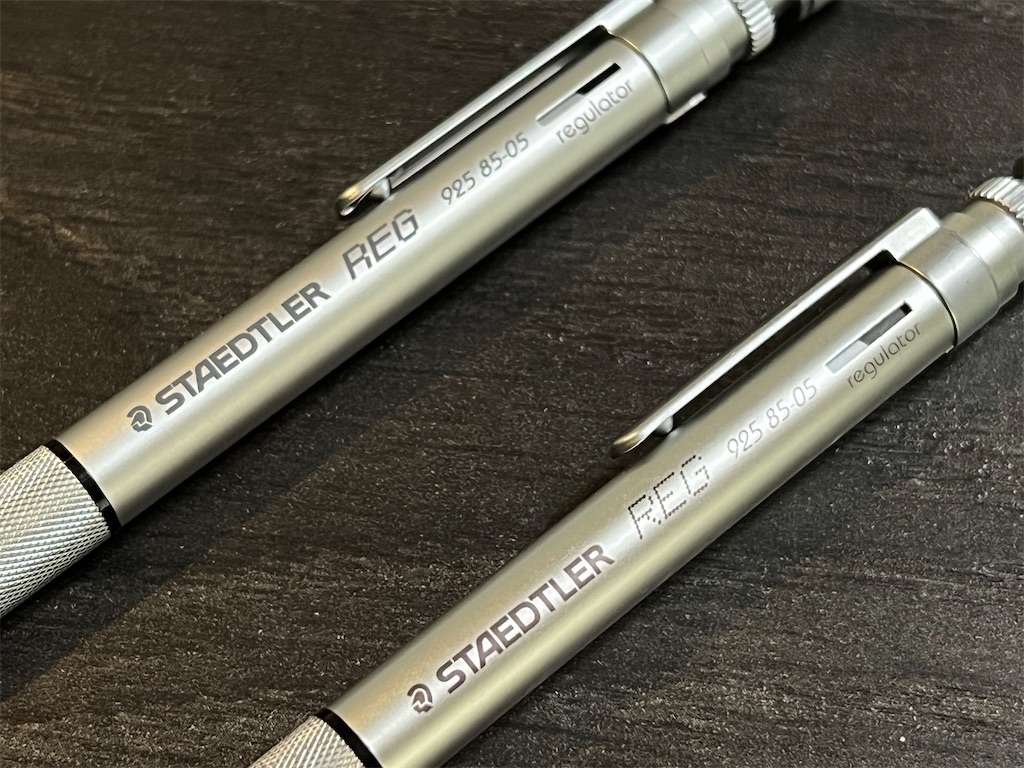
As for the grips, they appear to be the same. The diamond-patterned knurling indeed feels "aged". The ridges are flat, but thankfully not too slippery.
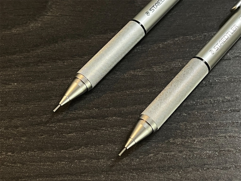
If I hadn't read the copy on the package, I might have complained that the grip was too flat. But now that I know what to expect, I can kind of imagine the pencils to be well-used, and by extension, making me an experienced user.

Regulator

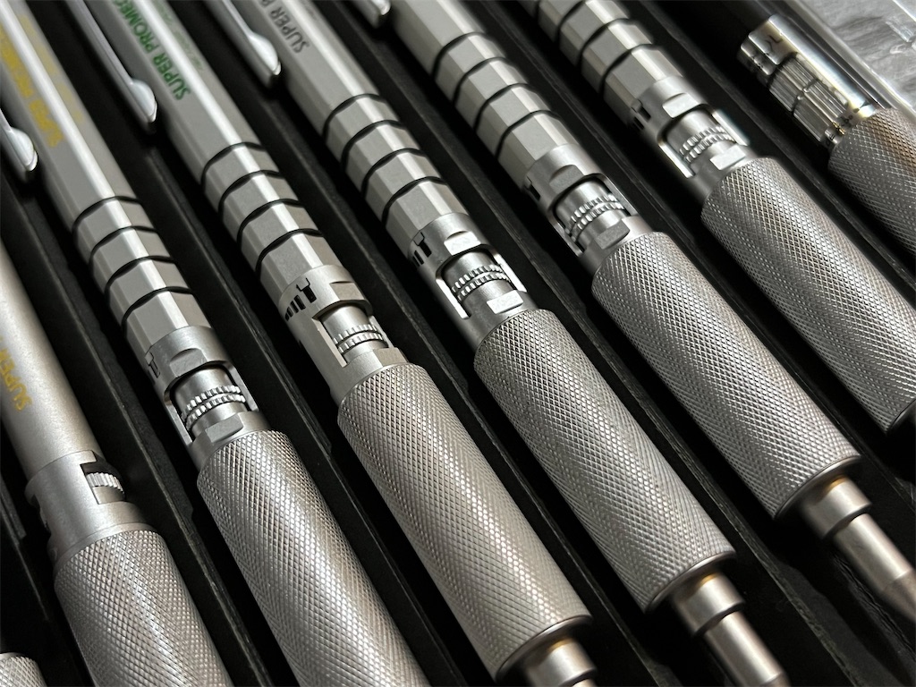
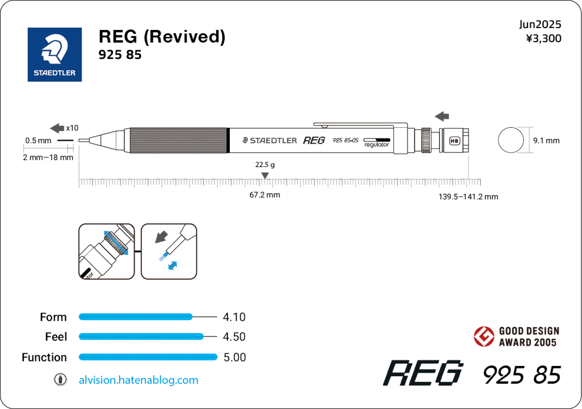
For anyone still wondering, yes, REG stands for regulator, the mechanism that adjusts how much lead is dispensed with each knock. It consists of a dial (previously called the "regulator grip" or "gear") at the end of the barrel and an analog indicator near the clip.
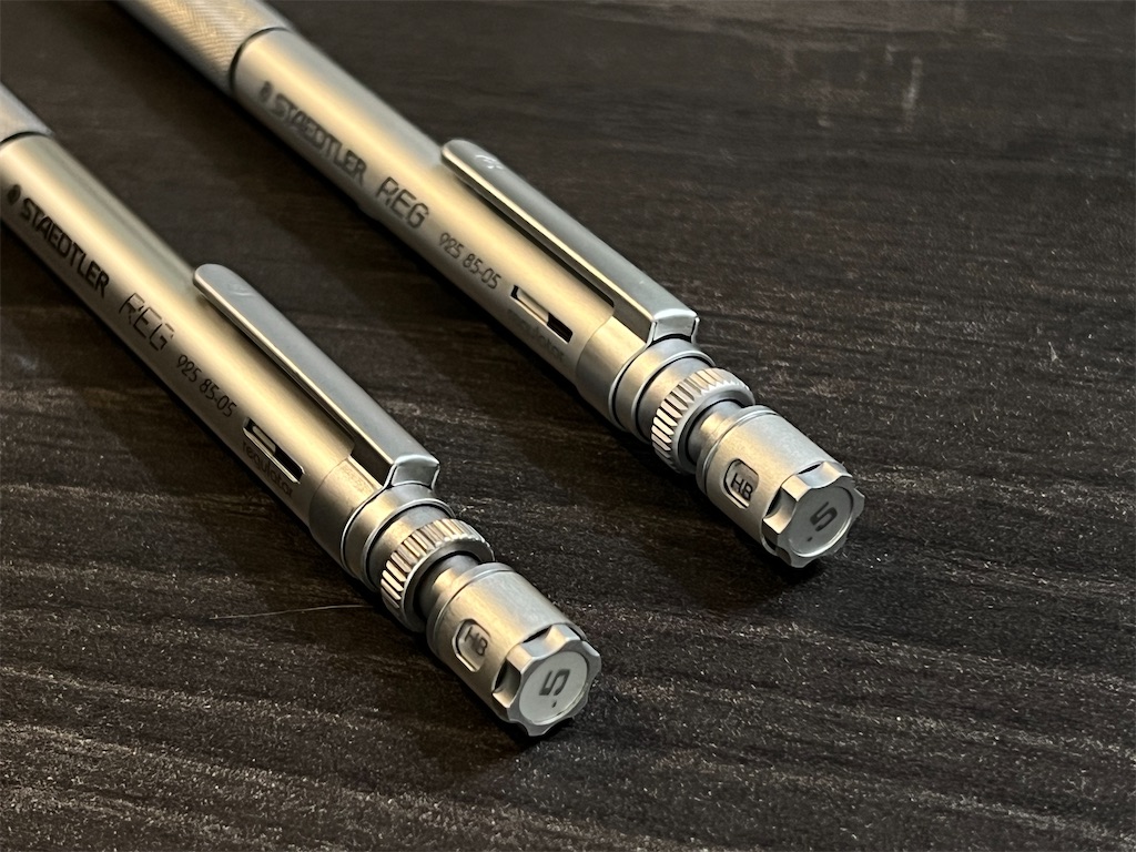
The Mechanism

Turning the dial raises or lowers the internal components—including the dial itself, the push button, the lead reservoir, the clutch, and any lead it holds—relative to the outer shell (which includes the barrel, clip, grip, and cone).

This has the effect of increasing or decreasing the distance between the clutch and the inner wall of the cone it presses against when you knock the push button. The distance determines how far the clutch can travel, and in turn, how much lead gets dispensed with each knock. Note that this also changes the total length of the pencil.
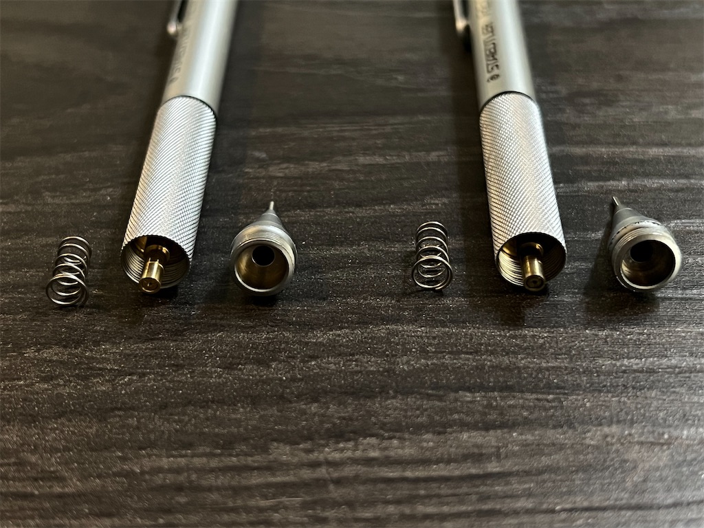
A similar mechanism can be found on REG's elusive sibling, the 925 95, and OHTO's SUPER PROMECHA series. But what those models lack is REG's analog indicator, which I think is a real stroke of genius.
f:id:alvision:20250808001450j:image

The Indicator

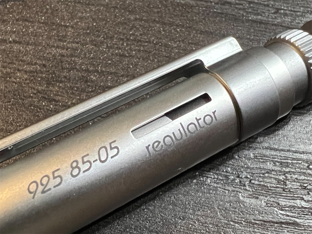
It's essentially a slit on the barrel that reveals the tube underneath. A sloped black shape on the inner tube acts as a gauge that fills or empties the slit as the dial turns, indicating the amount of lead each knock dispenses.
f:id:alvision:20250808001501j:image

The Feel

The inner parts on the original REG fit somewhat loosely inside the barrel, making the whole mechanism a bit shaky, and I could feel the parts scraping as I turned the dial.

In contrast, the regulator on the revived REG fits more snugly and requires a bit more force to turn, but feels steady and smooth throughout.

Theoretically, you only need to find your ideal length once, and shouldn't need to fiddle with the regulator often. But the it's so satisfyingly smooth that I keep turning it just for the feel.

Range of Length

So what is the ideal length?

For me, it's about 1 mm per knock, which falls right in the middle on the revived REG.

I measured the length of lead dispensed on my original and revived REGs after 5 knocks at the max setting, and 20 knocks at the min setting, and calculated the average length per knock. My original REG advances more lead than the revived one.
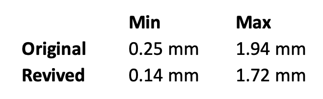
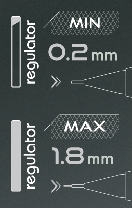
While not stated on the packaging or the product page, the min and max lengths were specified as 0.2 mm and 1.8 mm in their promotional video and press release.
Push Button

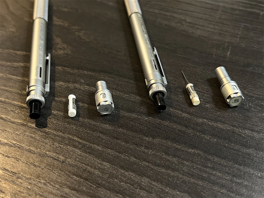
The exposed parts of the push buttons look identical, but the revived REG felt firm and steady, while the original felt a bit loose and was louder in operation. Pulling off the buttons revealed some differences. The revived REG has a shorter neck, and no longer has the clearing rod under the eraser.
f:id:alvision:20250806234927j:image

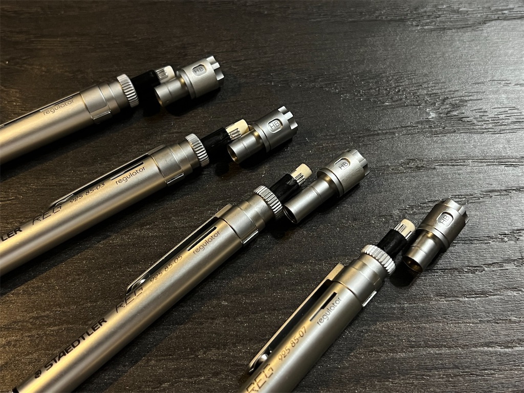
I checked my 0.3 mm and 0.7 mm. Oddly they have the shorter neck, like the revived REG. So this change happened before they stopped production in 2013.
f:id:alvision:20250812013509j:image

The buttons are interchangeable, but changing them has no effect on the rattling parts. My guess is it was just a way to reduce cost.

Lead Grade Indicator

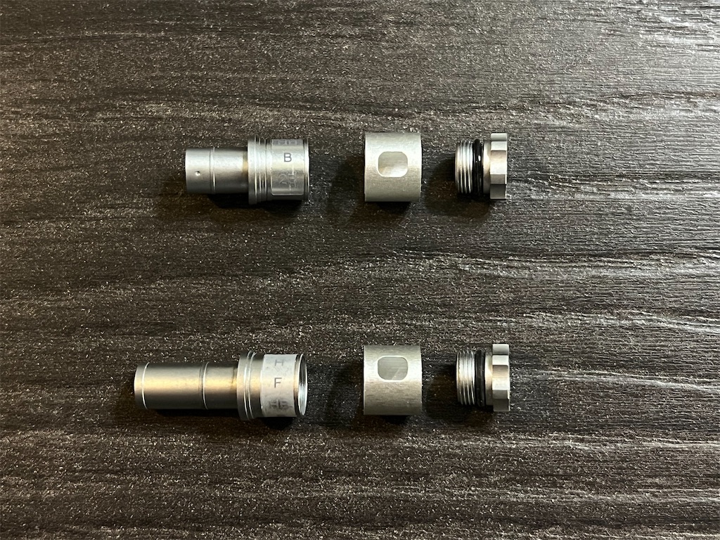
Despite the cog-like appearance (which STAEDTLER says was inspired by the bezel of a diver's watch), the cap of the push button is not meant to be turned when adjusting the lead grade indicator—it's for taking the whole assembly apart.
f:id:alvision:20250806234942j:image

The construction of the lead grade indicator remains unchanged: a rubber O-ring holds the cap in place, and the lead grades are still a printed strip wrapped around the upper section of the push button.

Writing

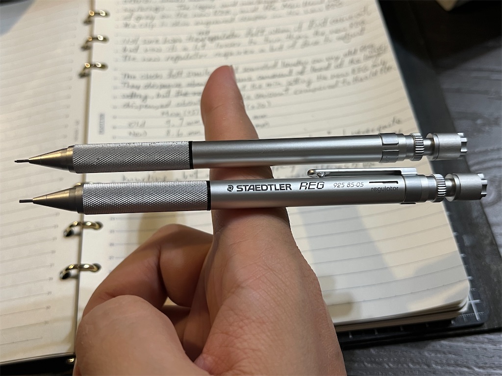
Both the original and the revived REG are excellent for writing (or drafting), the tips deliver firm, percussive feedback with high visibility. The weight balance is good too, with the center of gravity lowered slightly further in the revived REG.
f:id:alvision:20250806234939j:image

As mentioned earlier, the parts at the rear end of the original REG move and rattle during use. This was the one main complaint users had with the original REG. But the pencil had been discontinued long enough that most users stopped caring.

While it's exhilarating to see REG making a comeback, I'm more impressed that STAEDTLER is willing to address these decade-old issues while staying true to the original design. It shows their commitment to making better pencils, rather than reviving a popular model (or even worse, bastardizing one) to squeeze more profit.

Rating

My overall rating for the revived REG is 4.5, up from 4.0 for the original REG, and as usual I've drawn a review pen card. It's a fun little side project for me, and I really enjoyed drawing the REG. I hope you've enjoyed the review too.

LACONIC Solid Write Quick Look

The mechanical pencil market has seen some quality releases from several new brands in recent months, one of them being the LACONIC Solid Write.

f:id:alvision:20250729202916j:image

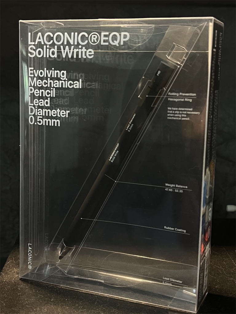
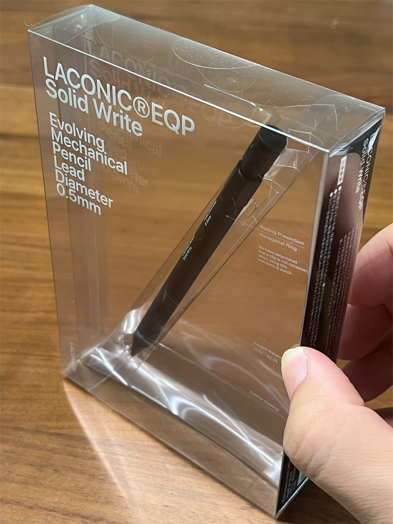
To my knowledge, LACONIC mainly sells diaries, and this is their first mechanical pencil. It comes in this large, flat, transparent plastic box, giving it the look of a pencil encased in an acrylic plaque (the internal sleeve doesn't seem to hold on to the pencil very well).

f:id:alvision:20250729203015j:image

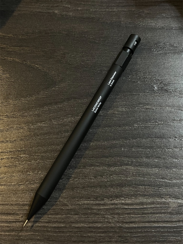
The pencil has a cylindrical metal body with rubber coating. It does not have a clip—because they "determined that a clip is not necessary"—but does feature a Hexagonal Ring to prevent the pencil from rolling off the desk.

f:id:alvision:20250729203107j:image

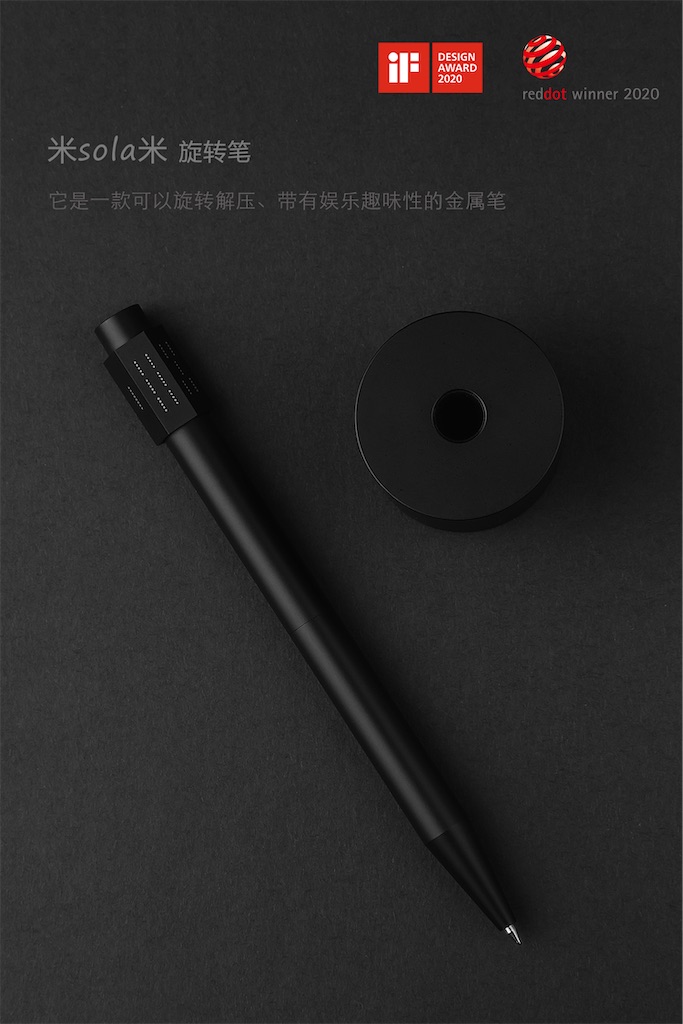
It does double as a dice though, all you need to do is paint the faces. Maybe they got the inspiration from this "Decompression Pen" released few years ago.
f:id:alvision:20250729212046j:image

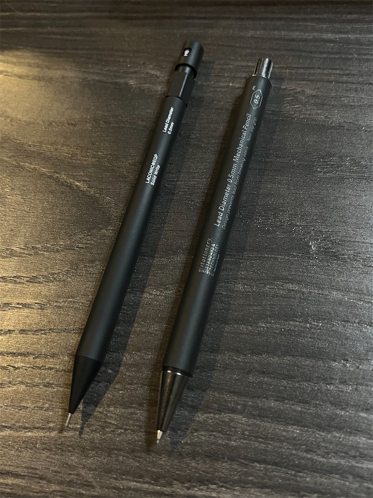
If we ignore the Hexagonal Ring, the design reminds me of STÁLOGY's mechanical pencil—a plain-looking pencil with some subtle but useful mechanisms.
f:id:alvision:20250730002407j:image

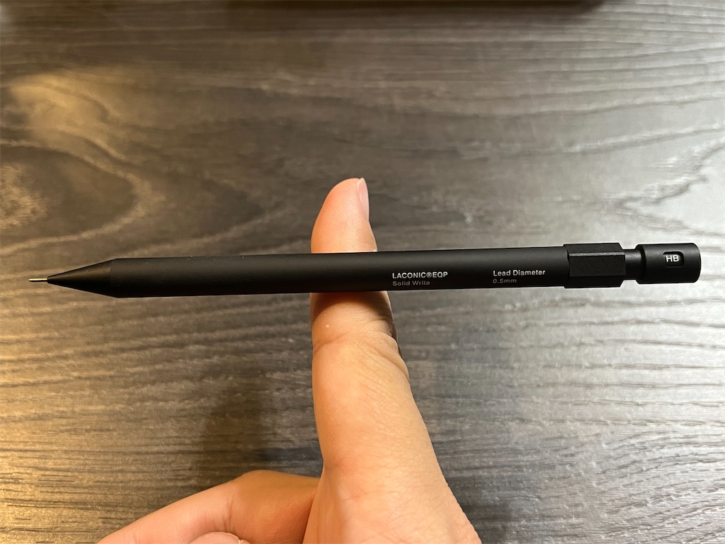
But when picked up, Solid Write feels noticeably different. Although not particularly heavy at 23 g, the moment of inertia drags slightly on the hand, despite the low center of gravity. My guess is the weight is evenly distributed along the barrel. The good news is, it didn't feel sluggish when writing.

f:id:alvision:20250730002418j:image

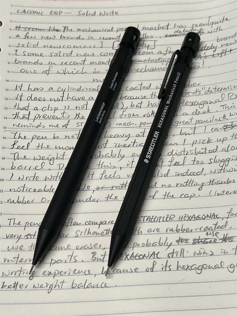
In the few reviews I could find online, the pencil is often compared to STAEDTLER's HEXAGONAL, for obvious reasons. The resemblance is striking, especially with the Clean Black colorway.

f:id:alvision:20250729203346j:image

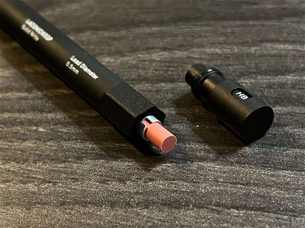
The similarities don't end there. Both barrels are made from rubber-coated metal, giving them a similar texture and feel. And both provide a solid writing experience, thanks in part to the O-ring hidden beneath the push button.

f:id:alvision:20250729203558j:image

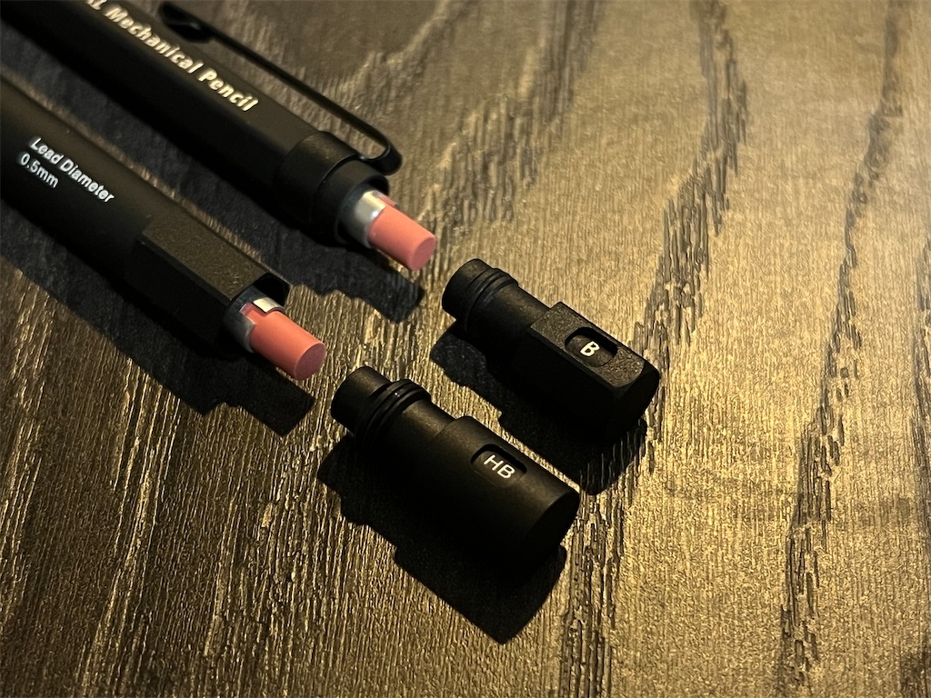
Seeing the salmon-pink eraser, and the silver lead reservoir it rests on, was enough to convince me that the two might really be related.

f:id:alvision:20250729203652j:image

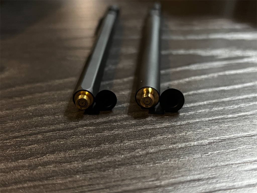
A look at the brass clutch near the tip further confirmed my suspicion—internally they are the same pencil.

f:id:alvision:20250729203712j:image

If that is indeed the case, they certainly picked the right pencil to build on, because in terms of writing solidity, few pencils can compete with HEXAGONAL, and Solid Write is no exception. The hexagonal grip and weight balance of HEXAGONAL still offer a significantly better writing experience (full review below). Let's hope LACONIC comes up with more surprises like this. A Liquid Write ballpoint pen next?

alvision.hatenablog.com

KOKUYO WP Quick Look

f:id:alvision:20250723143416j:image

This is the KOKUYO WP.

I remember seeing in a review that WP stands for “Writing Products,” but it could also mean “Writing Pen,” since that’s what it’s advertised as—a pen designed for writing.

f:id:alvision:20250723143432j:image

The pen looked boring. The cap is almost as long as the barrel, giving the capped pen a simplistic, nearly symmetrical silhouette.

f:id:alvision:20250723143449j:image

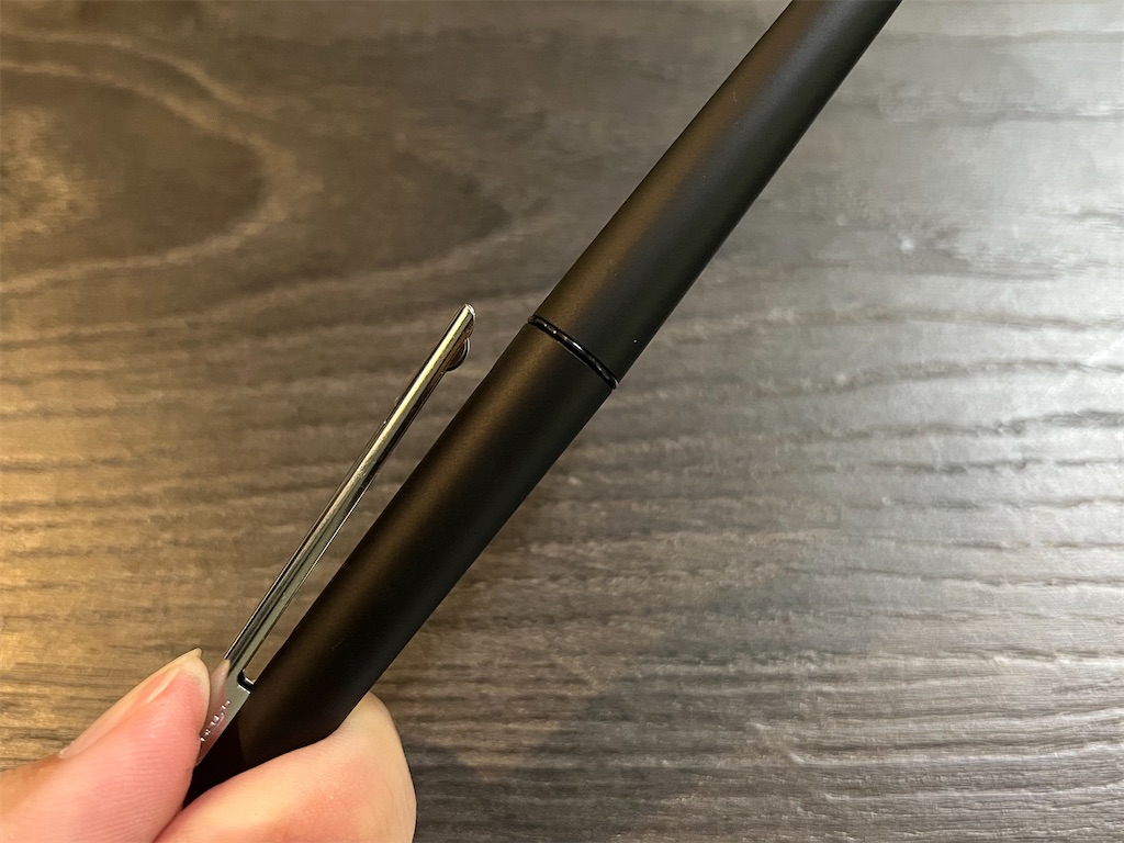
It feature an unusually long clip that’s spring-loaded at the base, making it easy to open with one hand. Still, it didn’t catch my interest—until I uncapped the pen.

f:id:alvision:20250723143521j:image

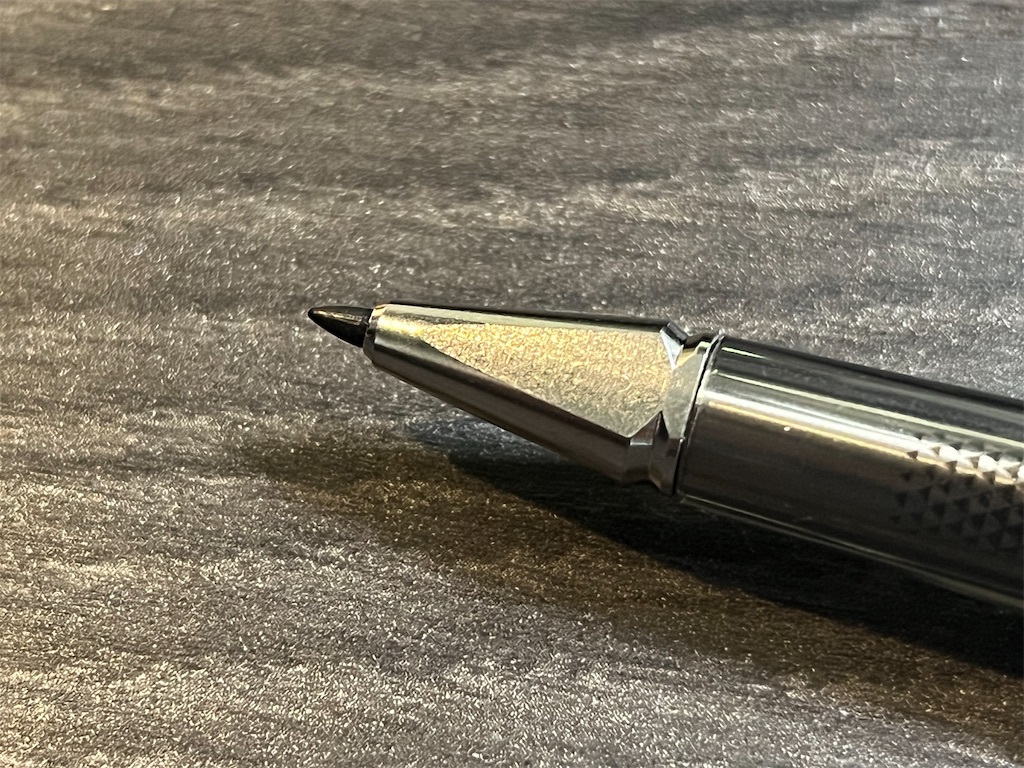
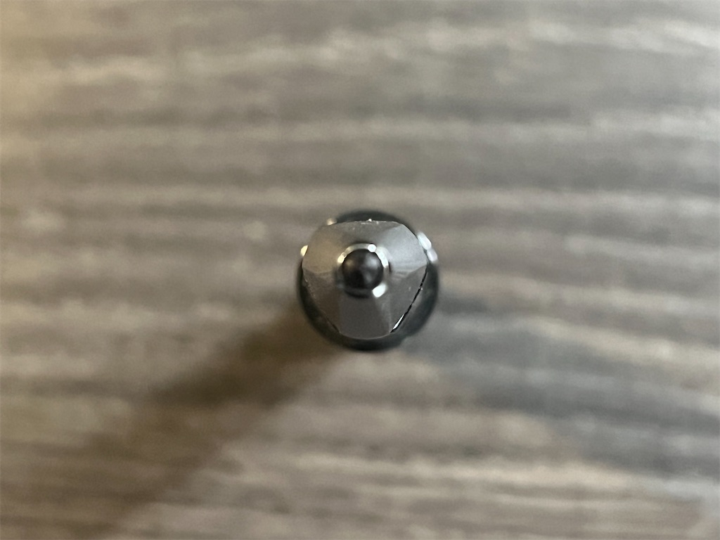
The pen has a unique arrowhead-shaped tip. It appears to be a metal cone with three sides machined off, leaving three flat faces with rounded edges that transitions to the triangular grip.

f:id:alvision:20250723143539j:image

f:id:alvision:20250723143558j:image

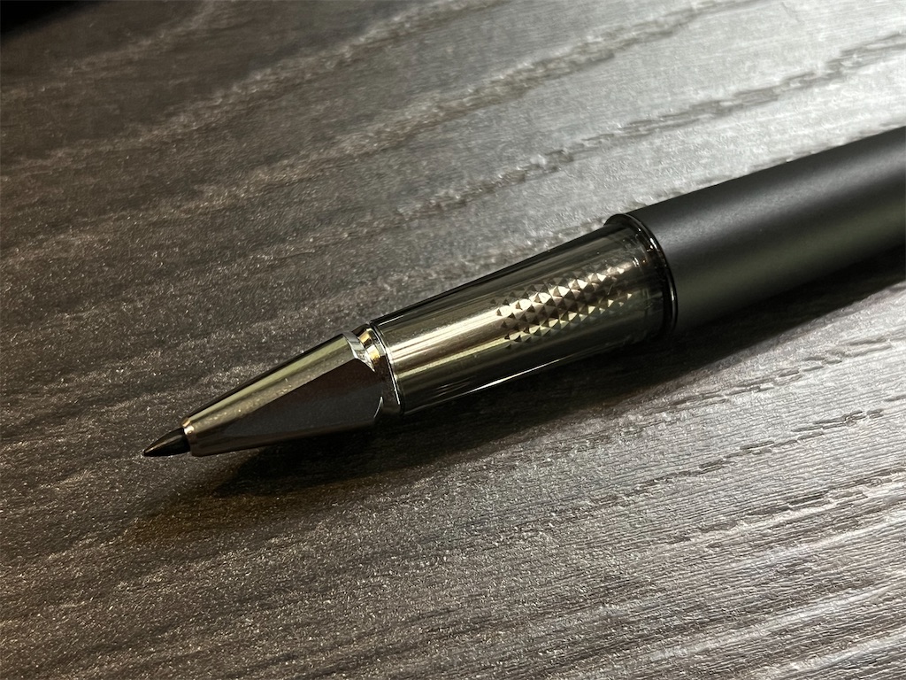
The transparent grip reveals a metallic tube with printed patterns that almost look like tiny indentations. At first I thought this was an inner extension of the tip, but it's actually the refill.

WP comes in two variants: Roller Ball, and Fine Writer. The difference being the installed refill. They have different markings on the grip section, but can be easily identified by their tip.

f:id:alvision:20250723143628j:image

These are standard Euro Style refills, so there are plenty of alternatives out there. But if you want the original look, go with the stock refills.

The Roller Ball uses water-based dye ink, probably equivalent to OHTO’s C-305 Ceramic Roller refill. The Fine Writer uses water-based pigment ink and was “developed in collaboration with SAKURA COLOR PRODUCTS,” but I couldn’t find a matching SAKURA refill.

f:id:alvision:20250723143703j:image

f:id:alvision:20250723143716j:image

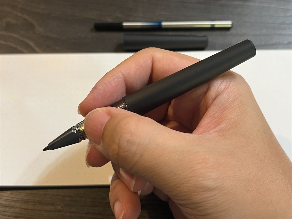
When unposted, the pen balances well with a comfortable tripod grip. The cap can be posted, but I wouldn’t do it for fear of wearing away the finish.

f:id:alvision:20250723143728j:image

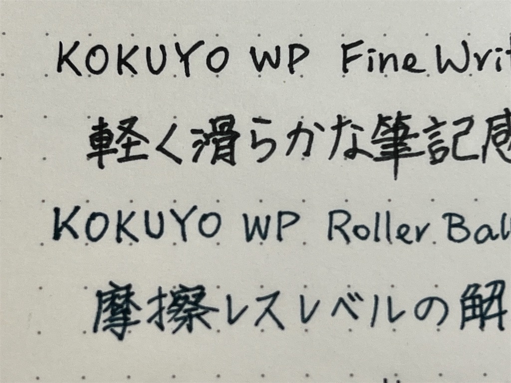
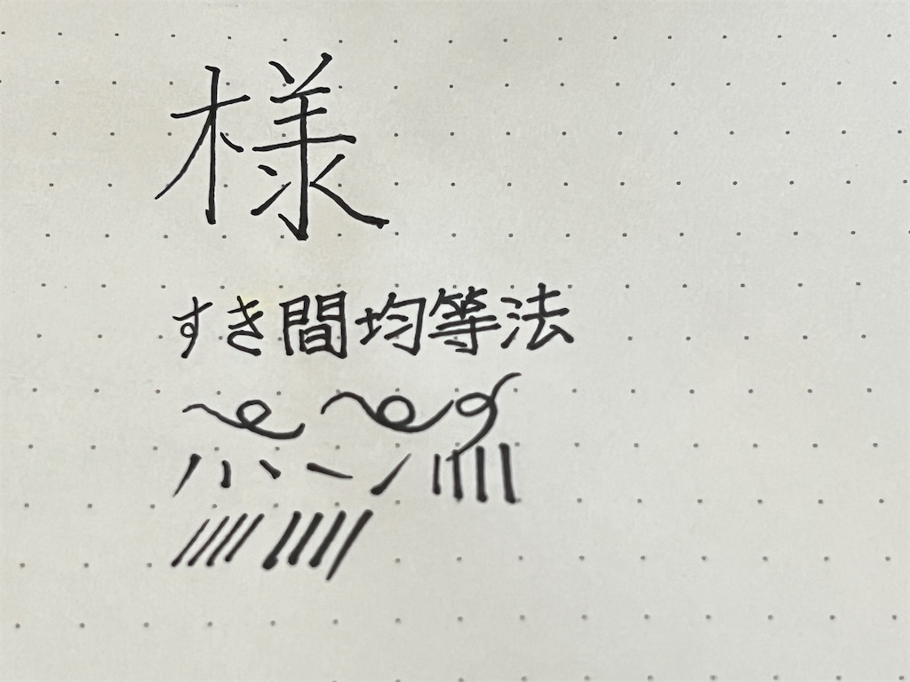
Both refills writes smoothly with no wobbles, but I personally prefer the Fine Writer, because the Roller Ball refill was too watery—the 0.5 mm refill writes almost like a 1.0 mm. The ink dries quickly, but it also bleeds fast.

The Fine Writer, on the other hand, has a plastic tip that's firmer than a felt tip, but still flexible enough to create lines of different weights. It's particularly well-suited for writing Chinese and Japanese characters.

f:id:alvision:20250723145857j:image

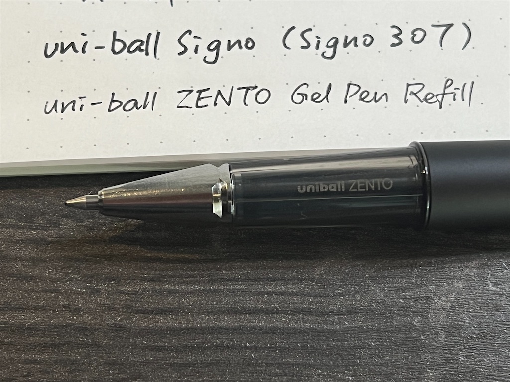
I tested a few other Euro Style refills, the OHOT C-300 fits perfectly, unsurprisingly. But so did some common gel-ink refills such as the new uni-ball ZENTO. I think these are good replacements for the stock Roller Ball refill, and doesn't look half bad when installed.

f:id:alvision:20250723144102j:image

It's worth mentioning that there’s a rubber O-ring inside the tip that tends to come off with the refill. Make sure to put it back and not lose it when replacing refills.

Truth be told, I’m not a big fan of KOKUYO, especially after their failed attempt to buy out Pentel back in 2019, and thought I’d never buy another KOKUYO pen.

But all in all, I really enjoyed using the WP, and I’m looking forward to getting my hands on the 2024 Limited Edition.

SAILOR TIME TIDE+ Quick Look

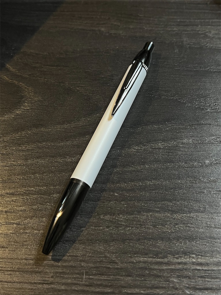
Picked up this ballpoint pen at MARUZEN Asahikawa.

f:id:alvision:20250717144720j:image
It was displayed on a low shelf among other ballpoint pens from various brands—looked like the store was selling what remaining stock it had.

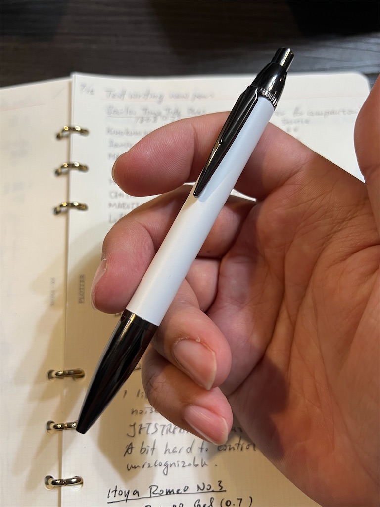
The white-on-black contrast caught my eye, so I picked it up and gave it a try. I was amazed by how smooth and stable it writes. It's totally comparable to the infamous JETSTREAM or Acroball pens, but I’ve never heard of this pen, or its ink.

f:id:alvision:20250717144803j:image

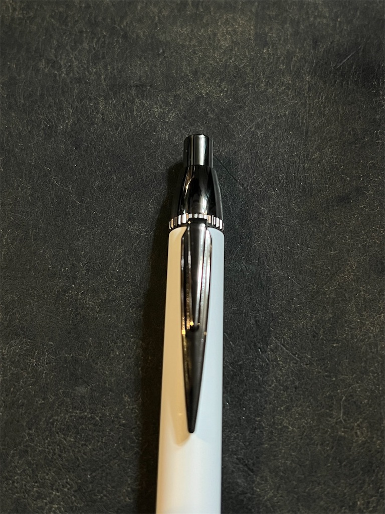
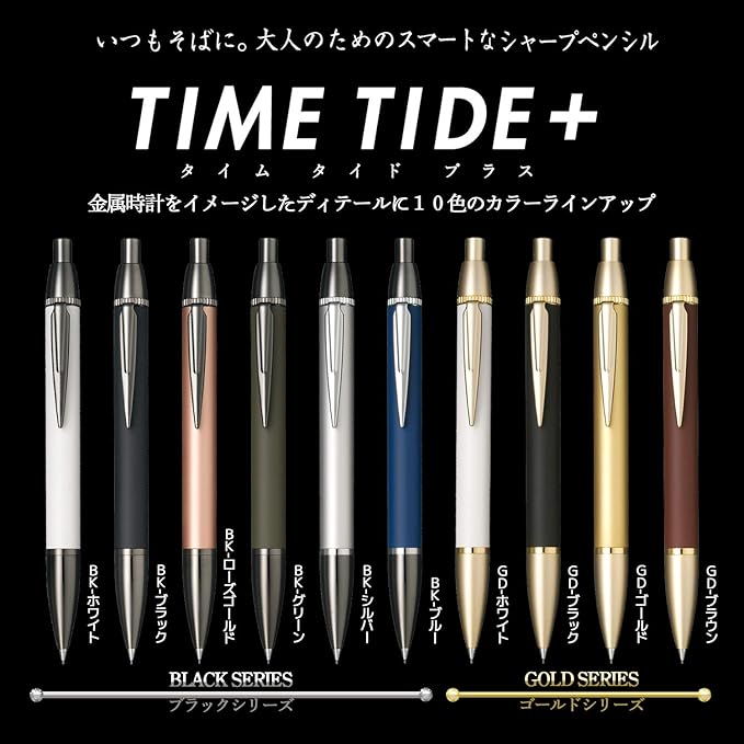
With a bit of research, I later learned that TIME TIDE+ was released in 2018 as an upgrade to the aluminum-bodied TIME TIDE series. The upgraded barrel is made from brass, with plated parts at both ends.

f:id:alvision:20250717144827j:image

The series came in 10 colors, 6 with black ion plating, 4 with gold plating, and included mechanical pencil variants as well. Unfortunately, they were all discontinued some time ago

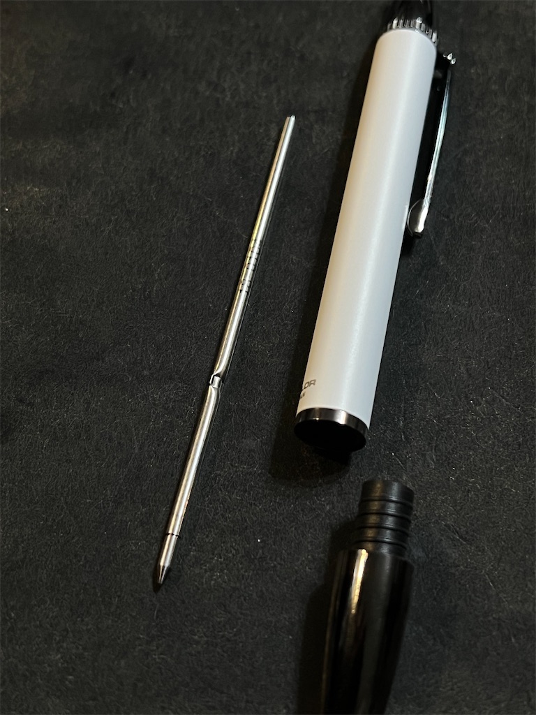
The pen uses a thin metallic 0.7 mm refill (18-0104), which is a bit concerning because I don't know where I can get this refill, and it doesn't appear to be compatible with other types.

f:id:alvision:20250717144838j:image

For now though, I'm more interested in finding a black variant, but no luck so far.

2025-08-11 Update

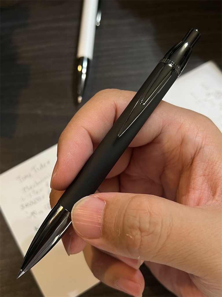
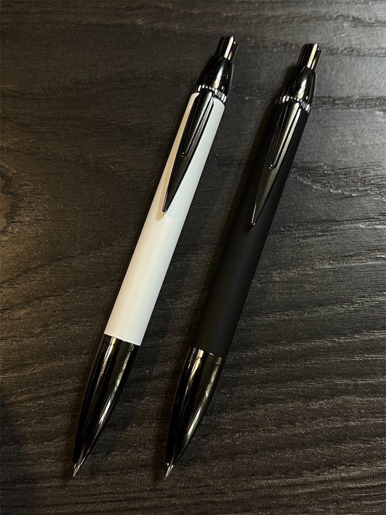
I searched all over the web, and didn't see a single listing of the black TIME TIDE+ ballpoint pen I was looking for. Luckily, I found a mechanical pencil in black, and it arrived today.

f:id:alvision:20250811224522j:image

It's as beautiful as the white ballpoint pen. I love how the matte black barrel complements the ion plated parts.

I think the TIME TIDE series as a whole was designed as a ballpoint pen first. But the mechanical pencil writes surprisingly well, with solid feedback and no wobbles whatsoever.

Unfortunately the clutch is made of plastic, so it can't hold on to the lead if too much force is applied. And it certainly will not last the tides of time.

f:id:alvision:20250811231155j:image